City Cycles UX Design

As part of my Skillcrush UX class, I was tasked with improving the user experience of an existing online bike reservation system for a client named City Cycles. City Cycles is a local bike shop whose main business is renting out bikes to locals and visitors in the Riverside area. City Cycles discovered that their online reservation system was inefficient, requiring users to send emails to the shop in order to rent a bike. This led to users leaving the site completely and either calling the shop to make their reservation or forgoing one entirely. I was hired to improve the site's online bike rental UX in order to make the rental process easier and more user friendly for City Cycles, thus increasing the number of rentals they receive.
Original Site
The New Prototype
The Process:
Key Findings:
After performing UX research, collecting data, conducting user interviews and analyzing the results, this is what I found:
Our users are mainly local young adults who want a better way to get around/explore Riverside.
Over 80% of users leave the site as soon as they click on the reservation link.
The amount of online bike rentals steadily decreases as time goes on; people are not returning to the site for reservations.
A majority of users find the site “frustrating” and “annoying”.
This lead to our hypothesis: We have the belief that by creating a more user friendly online reservation system that visually shows each step and reservation confirmation, it will lead to the users completing more online bike reservations.
My Solution:
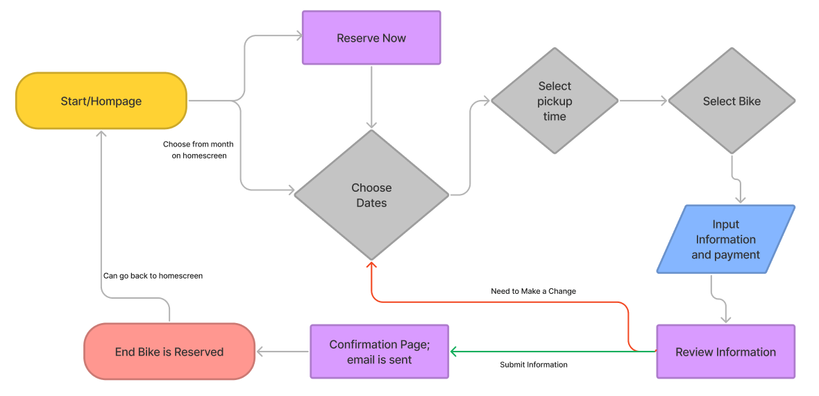
I created a multistep reservation system that is easy to use, understand and complete. It starts with the user’s choosing their desired date(s) for their rental, their pickup time, the type of bike they want and then it wraps up with their reservation and payment information. As the user completes each part of the process they will be notified immediately on the screen on if the date, time, and bike is available and if their payment/information was entered correctly. Along the top of the screen is a progress bar so users know exactly which step of the reservation process they are on.
Overall this new design is easy to use and understand, thus solving the issues users were facing with the original site.


Website Planning:
User Flow for City Cycle’s Reservation Prototype
Initial Paper Wireframe for City Cycle’s Homepage
Final Digital Wireframe for City Cycle’s Homepage
Finished City Cycle’s Homepage Prototype
Proposed Next Steps:
Based upon the results of my usability test, I proposed that the current prototype effectively solved City Cycles usability issue and thus is ready to launch. This prototype allows users to easily make and pay for a bicycle reservation completely online, which eliminated the original problem of having to either call the shop or purchase a rental in person. In the future, I would recommend adding a blog and a page dedicated to all of the information users will need on the rental process, the area, and the company itself. I believe that by adding these pages, users will stay on the City Cycles site longer and thus are more likely to rent a bike or purchase merchandise from the shop.
